
Course pages 2014–15
Graphs, figures and tables
Link to Slides for Lecture 10 and 11
Link to Encyclopaedia article on visual representation
Example data sets for assigned exercise 4
- The Guardian Data Blog
- Data.gov.uk
- The U.S. Government open data site
- The Google public data directory
Video lectures
You can view the 2012 lectures on these topics, as delivered by Neil Dodgson:
Good and bad graphs (24 minutes)
Figures, Tables, Maths, Algorithms (25 minutes)
Two live examples of creating basic graphs (15 minutes)
Two live examples of using graphs to explore data (10 minutes)
Further resources from previous years
- Lecture 3 ("Good & Bad Graphs") of Ross Ihaka's course on Information Visualisation is a good introduction to some of things to watch for when graphing.
- Steve Simon has some nice Guidelines for Good Graphics (290kB PDF), which includes references to the academic papers that justify each of his rules (see below).
- Neil Dodgson has produced a case study (104kB PDF) of the figures, tables, and graphs in his 2011 SPIE paper (3MB PDF), written with 2009-10 MPhil student Melinos Averkiou.
- Neil Dodgson has made a simple example of how to improve the readability of a table of results.
Notes
Good & Bad Graphs: Concepts
Based on Ross Ihaka's lecture (see above).
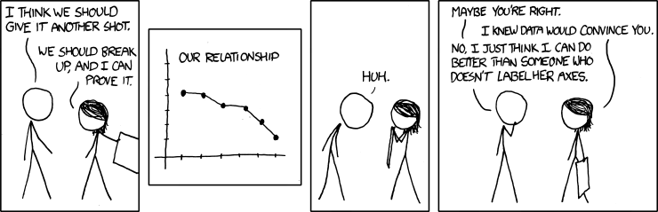
- The basics Choose the correct type of graph for the data. Label the graph. Label the axes.
- Data content Small amounts of data do not require graphs. The human brain can easily grasp one, two or three values.
- Data relevance You cannot produce a good graph from bad data: graphs are only as good as the data they display.
- Complexity Graphs should be no more complex than the data they display. Avoid "chart junk": irrelevant decoration, unnecessary colour, 3D effects. Use the ink to display the data, not junk.
- Distortion Graphs should not give a distorted picture of the values they portray.
- Story Decide what "story" you want the graph to tell. The same data can tell many stories, what is important for communicating your ideas?
Six Principles for Good Graphics
Based on Steve Simon's notes (see above).
- The Minimum Ink Principle Avoid gimmicks like pseudo 3-D effects or fancy crosshatching. Use the minimum amount of ink to get your point across.
- The Small Table Principle A small table is better than a large graph. If your graph contains 20 data points or less, consider a table of numbers instead.
- The Error of Error Bars Principle Error bars are confusing and ambiguous. Plot all the data if possible, or use a box plot.
- The Size and Shape Principle. Carefully consider the size and shape of your graph. Rectangular graphs are sometimes better than square graphs. Bigger is not always better.
- The Reproduction and Reduction Principle Colours, shades of gray, and small symbols may get lost when a journal prints your graph, when a student photocopies your graph, or when a colleague prints your graph on a poor printer. Make sure your graphs can withstand reproduction and reduction.
- The Fault of Default Principle Graphing is an iterative process. Do nt rely on the default options provided by your graphics package. Try everything. Re-draw your graphs as often as you rewrite your text.