
 Measuring the Cambridge Lockdown
We have a comprehensive deployment of urban sensors in the region providing the opportunity for a real-time, spatially detailed, lockdown measure.
Ian Lewis, Director, Adaptive Cities Programme, Dept. of Computer Science & Technology, University of Cambridge, April 2020.
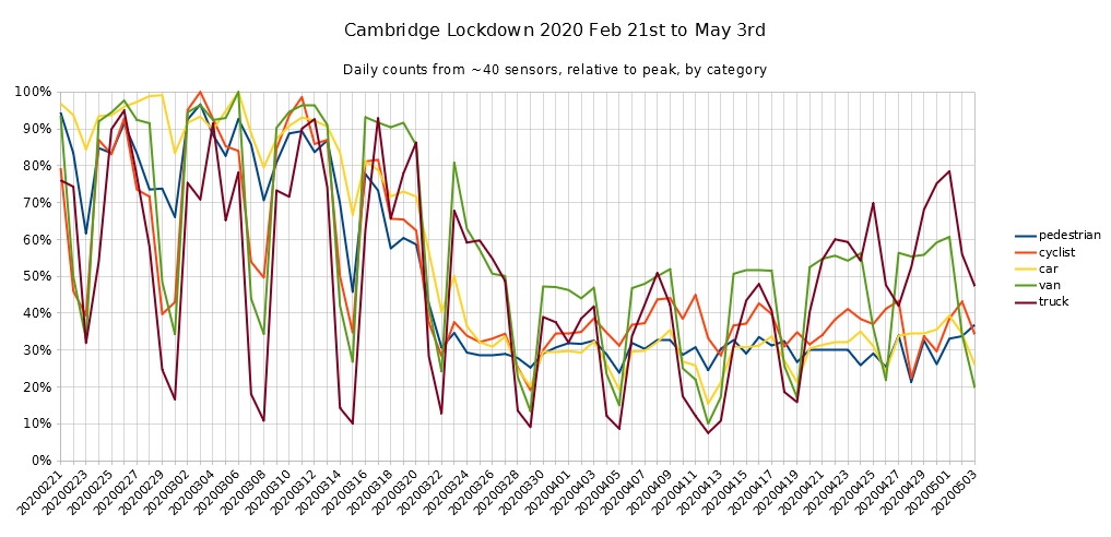
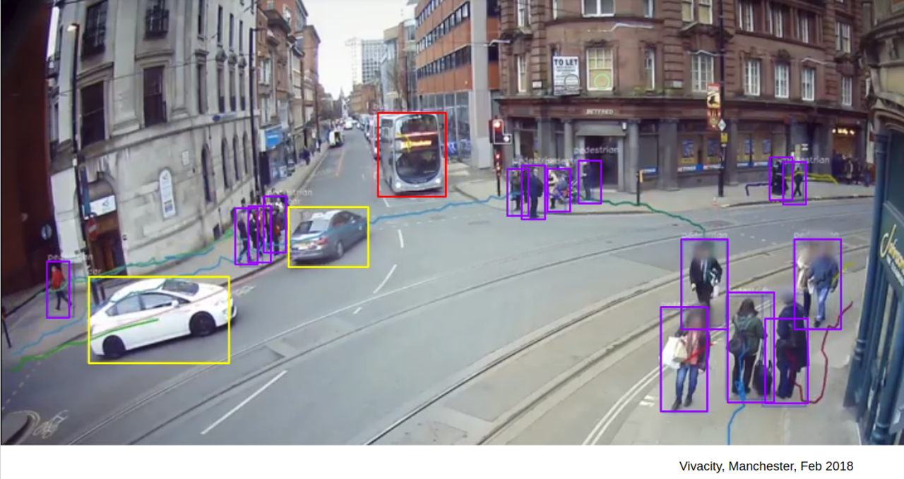
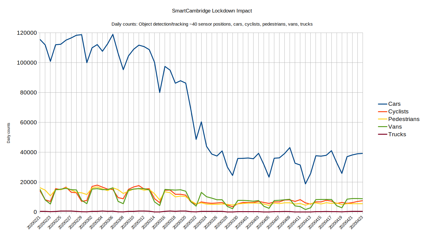
For these graphs we used the object detection and tracking numbers from our Vivacity image-based cameras, where pedestrians, cyclists, cars, vans and trucks are classified in each image and counted crossing virtual 'count lines' in five-minute intervals.
The graphs below summarize the impact over the time period Feb 21st 2020 (i.e. pre-lockdown) to April 23rd for the recognized categories. The chart at the top of this page provides the simplest overview of the lockdown impact, i.e. the percentage reduction in traffic over the period for each of the categories., with both car and pedestrian traffic reducing by 66% to around a third of their pre-lockdown values.
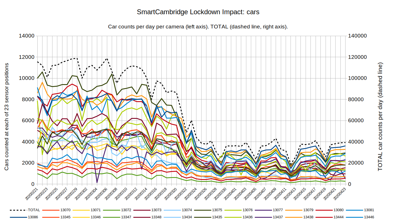
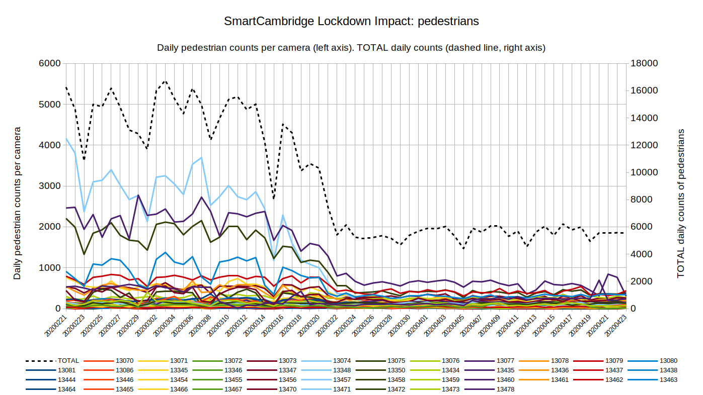
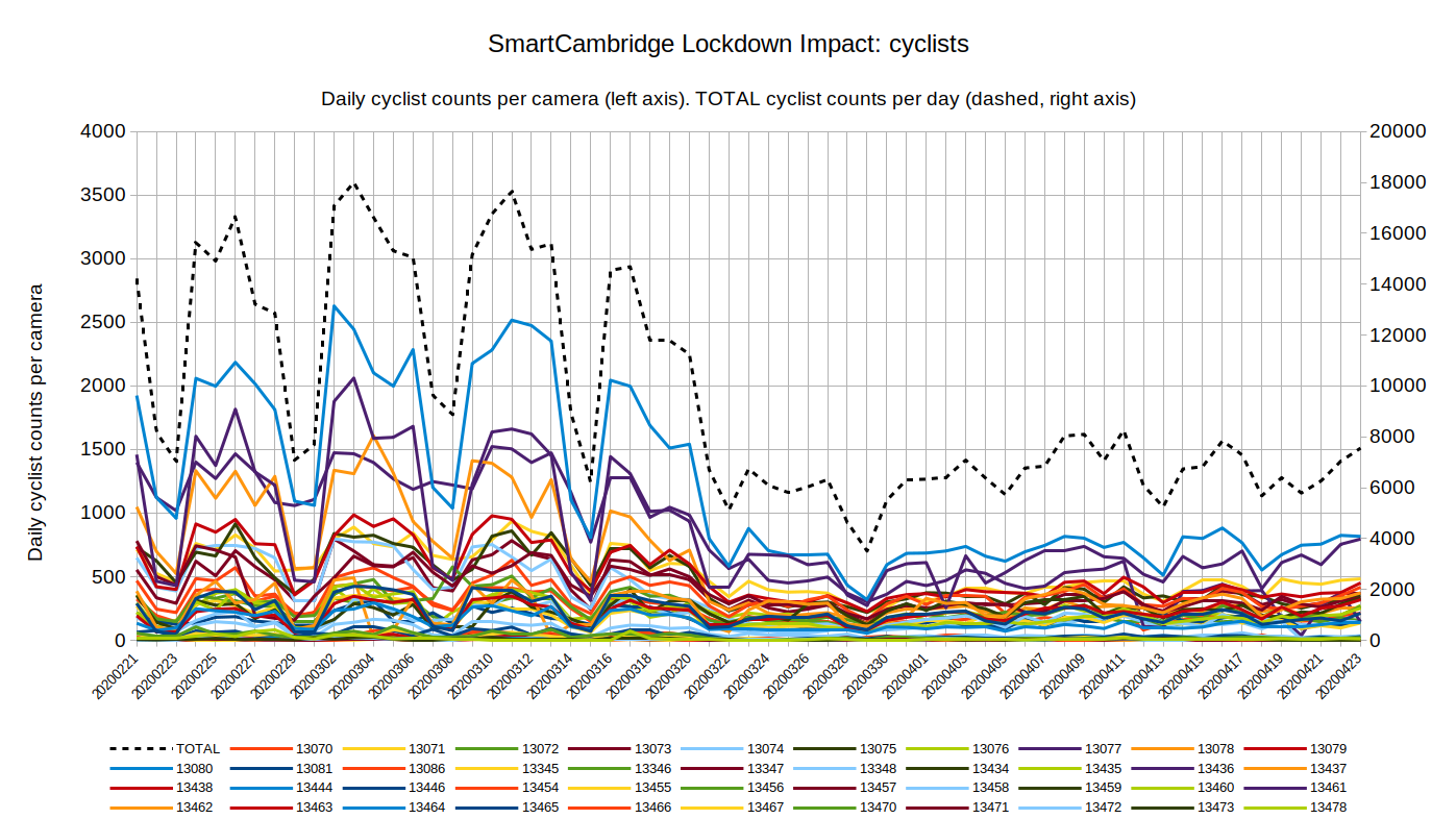
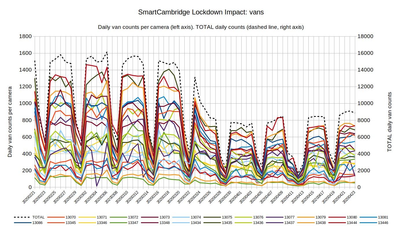
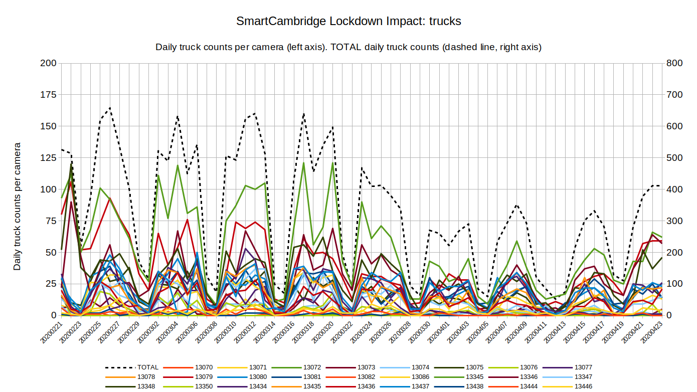
To provide a scale comparison for the various traffic types, the chart below overlays the daily total counts for each of the categories.
Brief commentary on the results of this analysis
This analysis provides a quantitative metric for the degree of lockdown which should be useful as the constraints are removed and we measure the return to normal mobility.
In due course it may be possible to correlate this metric with the degree of infection in the region, which might include an estimate of the time delay between lockdown actions and the effect on infections.
The 'intelligent' image-based sensors (i.e. trained neural networks) are particularly suited to providing image object counts for a pre-defined set of categories. This is advantageous when lockdown actions are intended to be asymmetric with regard to traffic types.
Why this analysis is good but not great
- Historic data rather than realtime. These charts are the result of a single analysis of data curated over a fixed time period (21st Feb to 23rd April 2020), even though the data is continuously available from the sensors with approximately 5-minute latency. The immediate impact of this is obfuscated by the fact the analysis uses data up until midnight yesterday (at the time of writing). The SmartCambridge platform is designed throughout to process incoming data in real-time so these 'lockdown metrics' could equally be provided as a real-time feed updating every five minutes. The benefits of this are unlikely to be recognized until after that real-time feed becomes available.
- Spatial reporting. We should expect a greater spatial density of these sensors and the analysis could show in real-time not only the degree of lockdown but an effective 'heatmap' of the lockdown across a large urban area (such as London).
- Metric relative to 'normal'. The analysis given here leaves it to the viewer to visually 'smooth' the curves and assess lockdown relative to the apparent 'normal' situation prior to the controls. Better would be to maintain a real-time 'normal' metric using historical patterns (e.g. relative to time of day, day of week, weather) such that the impact of changes is better understood.
- Sensor fusion. We have a variety of other sensors which would meaningfully contribute to an overall assessment of the lockdown measures (for example car parking occupancy). The analysis provided here was simplified by limiting the analysis to a single source.
In summary, intelligent urban sensors are particularly well suited to categorizing mobility and providing useful lockdown metrics. However, a snapshot of data from a single data source falls far short of what a state-of-the-art urban data plaform should be capable of producing.