Plot Figures
Owl is an OCaml numerical library. Besides its extensive supports to matrix operations, it also has a flexible plotting module. Owl’s Plot module is designed to help you in making fairly complicated plots with minimal coding efforts. It is built atop of Plplot but hides its complexity from users.
The module is cross-platform since Plplot calls the underlying graphics device driver to plot. However, based on my experience, the Cairo Package provides the best quality and most accurate figure so I recommend installing Cairo.
The examples in this tutorial are generated by using Cairo PNG Driver.
Create Plots
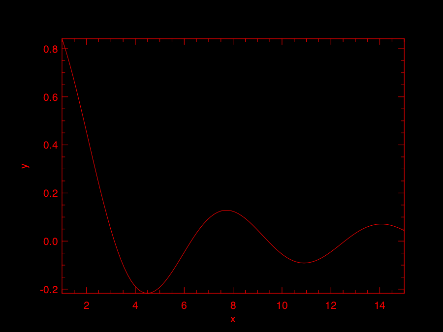
Simply put, there are two ways of plotting: 1) with a handle; 2) without a handle. You can imagine a handle is just a “pointer” to a figure. The first option is for lazy people who do not want to fine tune their figures but want to have a look at their results quickly. Most plotting functions in Owl can be called without an explicit handle passed in. E.g., the following code creates a simple line plot.
let f x = Maths.sin x /. x in
Plot.plot_fun f 1. 15.;;
However, in most cases, you do want to have a full control over the figure you are creating and do want to configure it a bit especially if you don’t like the default red on black theme. Then, here is the standard way of creating a plot using Plot.create function. Here is its type definition in Owl_plot.mli
val create : ?m:int -> ?n:int -> string -> handle
The first two parameters m and n are used for creating subplot, I will talk about subplot later. Now we only use the third parameter which defines the output file. Let’s extend the previous example.
let f x = Maths.sin x /. x in
let h = Plot.create "plot_003.png" in

Plot.set_foreground_color h 0 0 0;
Plot.set_background_color h 255 255 255;
Plot.set_title h "Function: f(x) = sine x / x";
Plot.set_xlabel h "x-axis";
Plot.set_ylabel h "y-axis";
Plot.set_font_size h 8.;
Plot.set_pen_size h 3.;
Plot.plot_fun ~h f 1. 15.;

Plot.output h;;
As we can see, we first create a plot handle h and also specified the output file as plot_003.png in create function. Owl will select the suitable output device driver for you based on the file name suffix. Then we call various functions in the Plot module to configure the plot by passing in h. These functions are self-explained, and you can read Owl’s documentation for details.
There are two thing worth mentioning here. First, you need to pass h to the plot function, i.e., Plot.plot_fun in this example. Second, the most important step is calling Plot.output h will actually write your figure to a file.
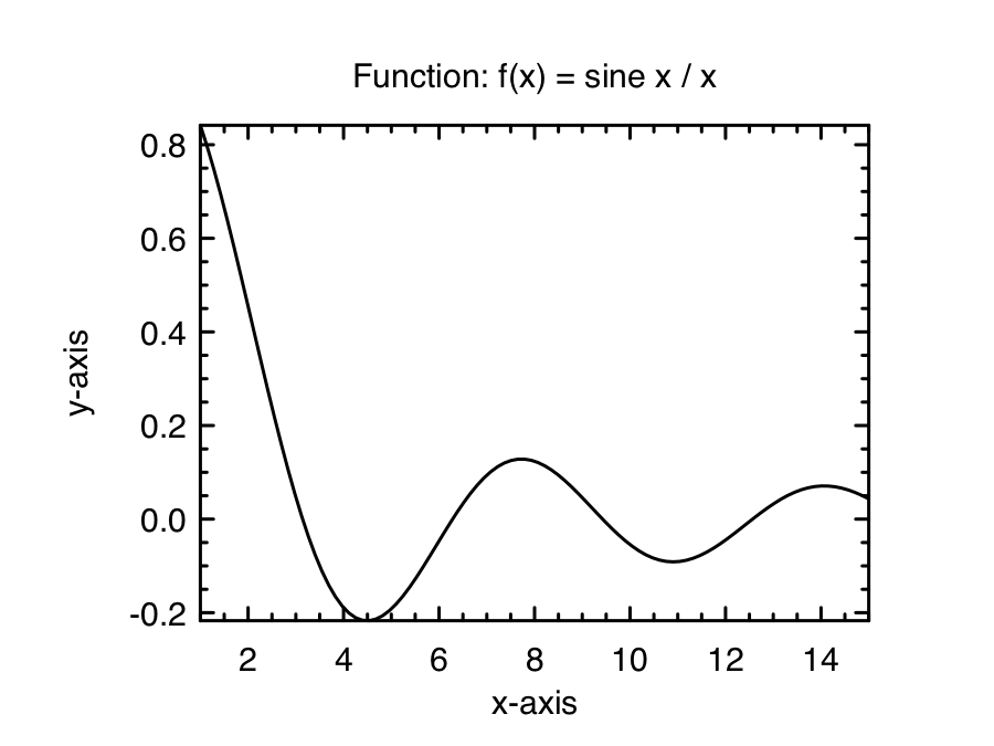
Simple, isn’t it? Let’s continue to more interesting plots.
Configure via Spec
Introduce spec …
Subplots
You use the same Plot.create function to start a subplot. E.g., the code below create a 2 x 2 subplot. We leave the output file name as an empty string so Plplot later will prompt a list of device drivers you can choose from, when you call Plot.output.
let h = Plot.create ~m:2 ~n:2 "" in
...
The key concept of subplot is: you need to successively call Plot.subplot to “focus” on different individual subplot to work on them. Continue the previous example, let’s look at the code below.
let f p i = match i with
  | 0 -> Stats.Rnd.gaussian ~sigma:0.5 () +. p.(1)
  | _ -> Stats.Rnd.gaussian ~sigma:0.1 () *. p.(0)
in
let y = Stats.gibbs_sampling f [|0.1;0.1|] 5_000 |> Mat.of_arrays in
let h = Plot.create ~m:2 ~n:2 "" in
Plot.set_background_color h 255 255 255;

(* focus on the subplot at 0,0 *)
Plot.subplot h 0 0;
Plot.set_title h "Bivariate model";
Plot.scatter ~h (Mat.col y 0) (Mat.col y 1);

(* focus on the subplot at 0,1 *)
Plot.subplot h 0 1;
Plot.set_title h "Distribution of y";
Plot.set_xlabel h "y";
Plot.set_ylabel h "Frequency";
Plot.histogram ~h ~bin:50 (Mat.col y 1);

(* focus on the subplot at 1,0 *)
Plot.subplot h 1 0;
Plot.set_title h "Distribution of x";
Plot.set_ylabel h "Frequency";
Plot.histogram ~h ~bin:50 (Mat.col y 0);

(* focus on the subplot at 1,1 *)
Plot.subplot h 1 1;
Plot.set_foreground_color h 0 50 255;
Plot.set_title h "Sine function";
Plot.(plot_fun ~h ~spec:[ LineStyle 2 ] Maths.sin 0. 28.);
Plot.autocorr ~h (Mat.sequential 1 28);

(* output your final plot *)
Plot.output h;;
The code will generate the following plot. You can control the configuration of each individual subplot once you have “focused” on it by calling Plot.subplot. Besides the figure handle h, Plot.subplot uses the two-dimensional index you pass in to locate the subplot.
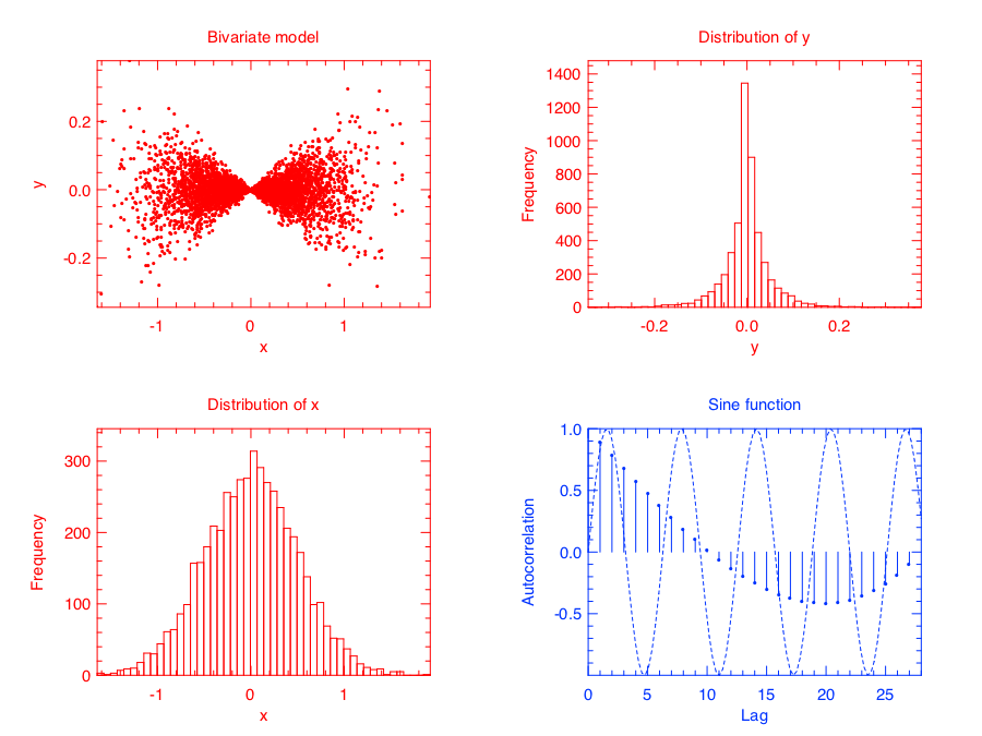
Plot module automatically calculates the suitable page size for your subplot. If you are not happy with the calculated size, you can also specify the page size by calling Plot.set_page_size function.
Subplot is quite straightforward, right?
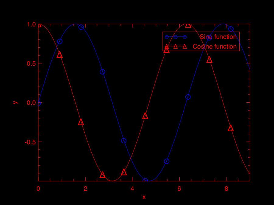
Multiple (Lines)
You can certainly plot multiple lines (or other types of plots) on the same page. Once you call Plot.output, the plot will be sealed and written into the final file. Here is one example with both sine and cosine lines in one plot.
let h = Plot.create "" in
Plot.(plot_fun ~h ~spec:[ RGB (0,0,255); Marker "#[0x2299]"; MarkerSize 8. ] Maths.sin 0. 9.);
Plot.(plot_fun ~h ~spec:[ RGB (255,0,0); Marker "#[0x0394]"; MarkerSize 8. ] Maths.cos 0. 9.);
Plot.legend_on h [|"Sine function"; "Cosine function"|];
Plot.output h;;
Here is another example which has both histogram and line plot in one figure.
(* generate data *)
let f p = Stats.Pdf.gaussian p.(0) 0.5 in
let g x = Stats.Pdf.gaussian x 0.5 *. 4000. in
let y = Stats.metropolis_hastings f [|0.1|] 100_000 |>  Mat.of_arrays in

(* plot multiple data sets *)
let h = Plot.create "" in
Plot.set_background_color h 255 255 255;
Plot.(histogram ~h ~spec:[ RGB (255,0,50) ] ~bin:100 y);
Plot.(plot_fun ~h ~spec:[ RGB (0,0,255); LineWidth 2. ] g (-2.) 2.);
Plot.legend_on h [|"data"; "model"|];

Plot.output h;;
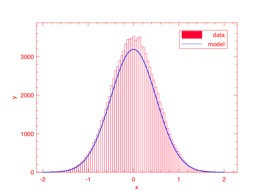
So as long as you “hold” the plot without calling Plot.output, you can plot many data sets in one figure.
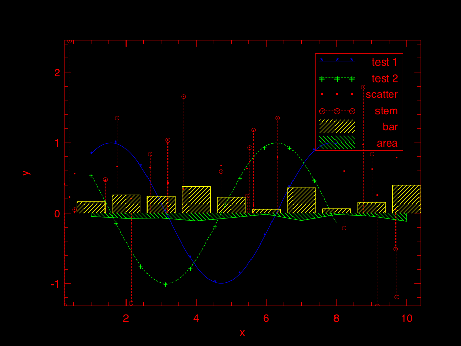
Legend
Legend can be turned on and off by calling Plot.legend_on and Plot.legend_off respectively. When you call Plot.legend_on, you also need to provide an array of legend names and the position of legend. There are eight default positions in Plot.
type legend_position =
  North | South | West | East | NorthWest | NorthEast | SouthWest | SouthEast
Despite of its messy looking, the following example shows how to use legend in Owl’s plot module.
(* generate data *)
let x = Mat.(uniform 1 20 *$ 10.) in
let y = Mat.(uniform 1 20) in
let z = Mat.gaussian 1 20 in

(* plot multiple data sets *)
let h = Plot.create "" in
Plot.(plot_fun ~h ~spec:[ RGB (0,0,255); LineStyle 1; Marker "*" ] Maths.sin 1. 8.);
Plot.(plot_fun ~h ~spec:[ RGB (0,255,0); LineStyle 2; Marker "+" ] Maths.cos 1. 8.);
Plot.scatter ~h x y;
Plot.stem ~h x z;
let u = Mat.(abs(gaussian 1 10 *$ 0.3)) in
Plot.(bar ~h ~spec:[ RGB (255,255,0); FillPattern 3 ] u);
let v = Mat.(neg u *$ 0.3) in
let u = Mat.sequential 1 10 in
Plot.(area ~h ~spec:[ RGB (0,255,0); FillPattern 4 ] u v);
(* set up legend *)
Plot.(legend_on h ~position:NorthEast [|"test 1"; "test 2"; "scatter"; "stem"; "bar"; "area"|]);
Plot.output h;;
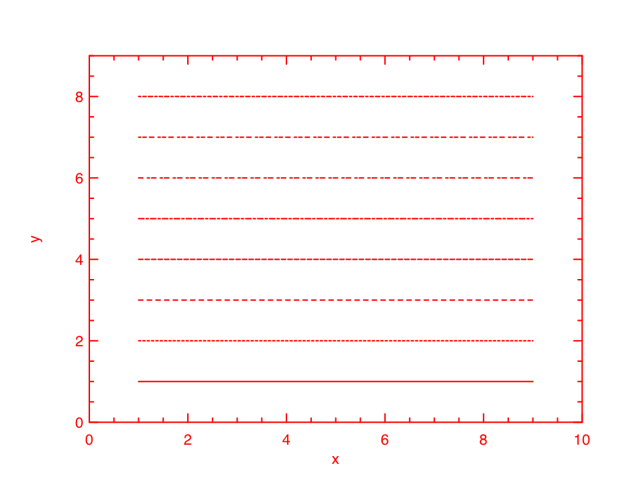
Drawing
You can draw lines and rectangles in the plot. The first example actually shows different line styles in Plot by drawing multiple lines.
let h = Plot.create "" in
Plot.set_background_color h 255 255 255;
Plot.set_pen_size h 2.;
Plot.(draw_line ~h ~spec:[ LineStyle 1 ] 1. 1. 9. 1.);
Plot.(draw_line ~h ~spec:[ LineStyle 2 ] 1. 2. 9. 2.);
Plot.(draw_line ~h ~spec:[ LineStyle 3 ] 1. 3. 9. 3.);
Plot.(draw_line ~h ~spec:[ LineStyle 4 ] 1. 4. 9. 4.);
Plot.(draw_line ~h ~spec:[ LineStyle 5 ] 1. 5. 9. 5.);
Plot.(draw_line ~h ~spec:[ LineStyle 6 ] 1. 6. 9. 6.);
Plot.(draw_line ~h ~spec:[ LineStyle 7 ] 1. 7. 9. 7.);
Plot.(draw_line ~h ~spec:[ LineStyle 8 ] 1. 8. 9. 8.);
Plot.set_xrange h 0. 10.;
Plot.set_yrange h 0. 9.;
Plot.output h;;
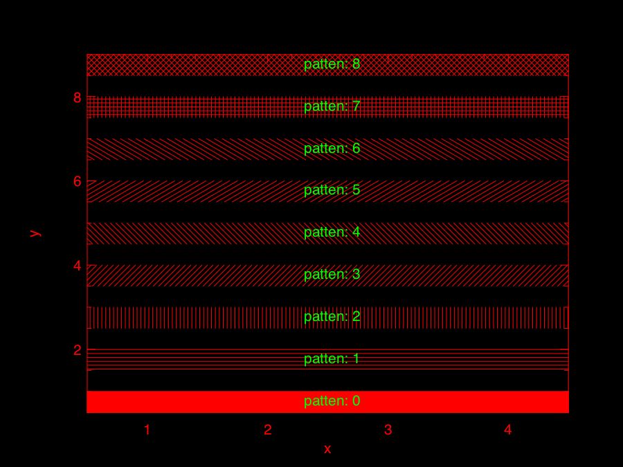
Similarly, the next example shows the filling patterns in Plot by drawing rectangles.
let h = Plot.create "" in
Array.init 9 (fun i ->
  let x0, y0 = 0.5, float_of_int i +. 1.0 in
  let x1, y1 = 4.5, float_of_int i +. 0.5 in
  Plot.(draw_rect ~h ~spec:[ FillPattern i ] x0 y0 x1 y1);
  Plot.(text ~h ~spec:[ RGB (0,255,0) ] 2.3 (y0-.0.2) ("pattern: " ^ (string_of_int i)));
);
Plot.output h;;
Various Types of Plot
In the following, I will use several examples to illustrate how to use the basic plotting functions in Owl.
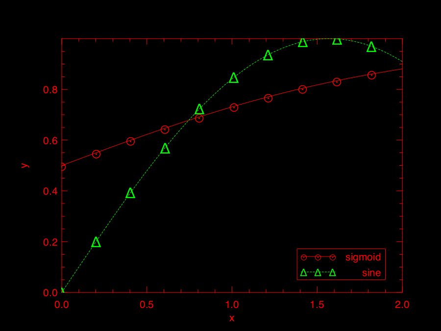
Line Plot
Line plot is the most basic function. You can specify the colour, marker, and line style in the function.
let x = Mat.linspace 0. 2. 100 in
let y0 = Mat.sigmoid x in
let y1 = Mat.map Maths.sin x in
let h = Plot.create "" in
Plot.(plot ~h ~spec:[ RGB (255,0,0); LineStyle 1; Marker "#[0x2299]"; MarkerSize 8. ] x y0);
Plot.(plot ~h ~spec:[ RGB (0,255,0); LineStyle 2; Marker "#[0x0394]"; MarkerSize 8. ] x y1);
Plot.(legend_on h ~position:SouthEast [|"sigmoid"; "sine"|]);
Plot.output h;;
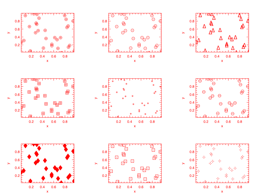
Scatter Plot
For scatter plot, the most important thing is the markers. You can check all the possible marker symbols on [this page](http://plplot.sourceforge.net/examples.php?demo=23), they can be passed in as a parameter to Plot.scatter function.
let x = Mat.uniform 1 30 in
let y = Mat.uniform 1 30 in
let h = Plot.create ~m:3 ~n:3 "zzz.png" in
Plot.set_background_color h 255 255 255;
Plot.subplot h 0 0;
Plot.(scatter ~h ~spec:[ Marker "#[0x2295]"; MarkerSize 5. ] x y);
Plot.subplot h 0 1;
Plot.(scatter ~h ~spec:[ Marker "#[0x229a]"; MarkerSize 5. ] x y);
Plot.subplot h 0 2;
Plot.(scatter ~h ~spec:[ Marker "#[0x2206]"; MarkerSize 5. ] x y);
Plot.subplot h 1 0;
Plot.(scatter ~h ~spec:[ Marker "#[0x229e]"; MarkerSize 5. ] x y);
Plot.subplot h 1 1;
Plot.(scatter ~h ~spec:[ Marker "#[0x2217]"; MarkerSize 5. ] x y);
Plot.subplot h 1 2;
Plot.(scatter ~h ~spec:[ Marker "#[0x2296]"; MarkerSize 5. ] x y);
Plot.subplot h 2 0;
Plot.(scatter ~h ~spec:[ Marker "#[0x2666]"; MarkerSize 5. ] x y);
Plot.subplot h 2 1;
Plot.(scatter ~h ~spec:[ Marker "#[0x22a1]"; MarkerSize 5. ] x y);
Plot.subplot h 2 2;
Plot.(scatter ~h ~spec:[ Marker "#[0x22b9]"; MarkerSize 5. ] x y);
Plot.output h;;
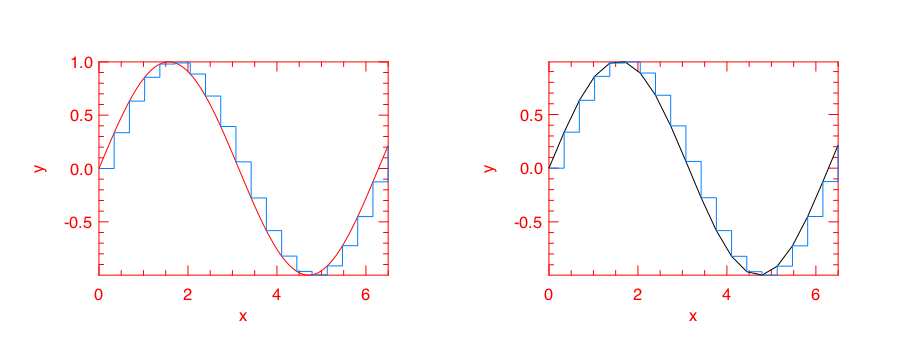
Stairs Plot
Instead of drawing a straight line between two points, stairs plot first moves along the x-axis then y-axis while plotting the data. The following example is self-explained.
let x = Mat.linspace 0. 6.5 20 in
let y = Mat.map Maths.sin x in
let h = Plot.create ~m:1 ~n:2 "" in
Plot.set_background_color h 255 255 255;
Plot.subplot h 0 0;
Plot.plot_fun ~h Maths.sin 0. 6.5;
Plot.(stairs ~h ~spec:[ RGB (0,128,255) ] x y);
Plot.subplot h 0 1;
Plot.(plot ~h ~spec:[ RGB (0,0,0) ] x y);
Plot.(stairs ~h ~spec:[ RGB (0,128,255) ] x y);
Plot.output h;;
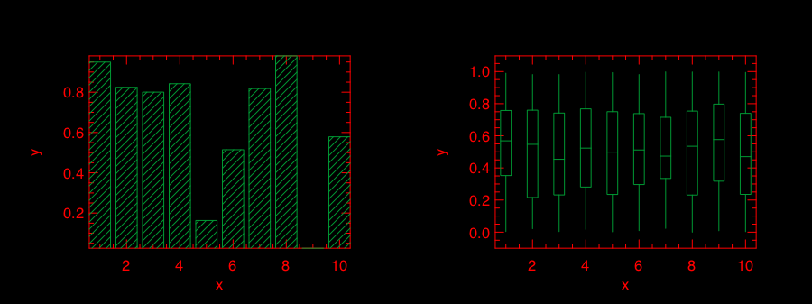
Box Plot
Box plots here generally refer to histogram, bar chart, and Whisker plot. You already learnt how to make a histogram plot. In the following, I will show how to make the other two.
Here is the example for making both bar chart and Whisker box. Just note the input to Plot.boxplot is a row-based matrix, each row represents multiple measurements of one variable, which correspond one box in the plot.
let y1 = Mat.uniform 1 10 in
let y2 = Mat.uniform 10 100 in
let h = Plot.create ~m:1 ~n:2 "" in
Plot.subplot h 0 0;
Plot.(bar ~h ~spec:[ RGB (0,153,51); FillPattern 3 ] y1);
Plot.subplot h 0 1;
Plot.(boxplot ~h ~spec:[ RGB (0,153,51) ] y2);
Plot.output h;;
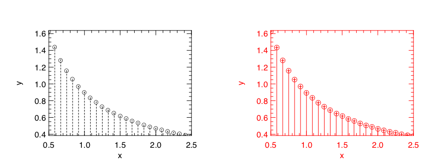
Stem Plot
Stem plot is simple, as the following code shows.
let x = Mat.linspace 0.5 2.5 25 in
let y = Mat.map (Stats.Pdf.exponential 0.1) x in
let h = Plot.create ~m:1 ~n:2 "" in
Plot.set_background_color h 255 255 255;
Plot.subplot h 0 0;
Plot.set_foreground_color h 0 0 0;
Plot.stem ~h x y;
Plot.subplot h 0 1;
Plot.(stem ~h ~spec:[ Marker "#[0x2295]"; MarkerSize 5.; LineStyle 1 ] x y);
Plot.output h;;
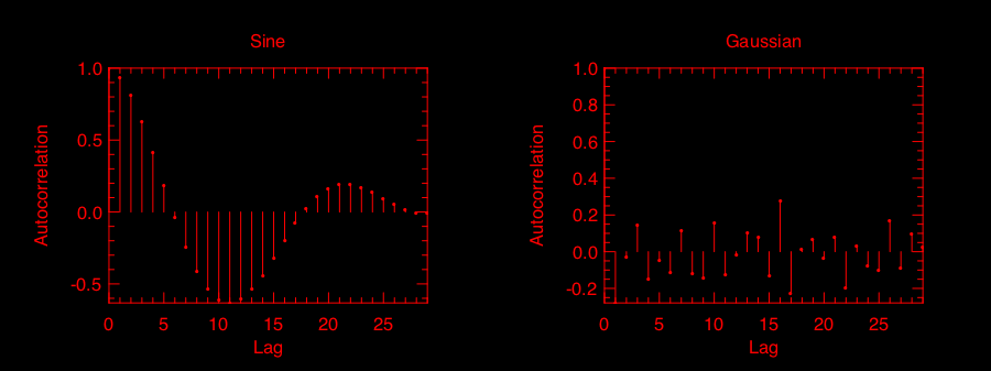
Stem plot is often used to show the autocorrelation of a variable, therefore Plot module already includes autocorr for your convenience.
let x = Mat.linspace 0. 8. 30 in
let y0 = Mat.map Maths.sin x in
let y1 = Mat.uniform 1 30 in
let h = Plot.create ~m:1 ~n:2 "" in
Plot.subplot h 0 0;
Plot.set_title h "Sine";
Plot.autocorr ~h y0;
Plot.subplot h 0 1;
Plot.set_title h "Gaussian";
Plot.autocorr ~h y1;
Plot.output h;;
Obviously, sine function possesses stronger self-similarity than Gaussian noise.
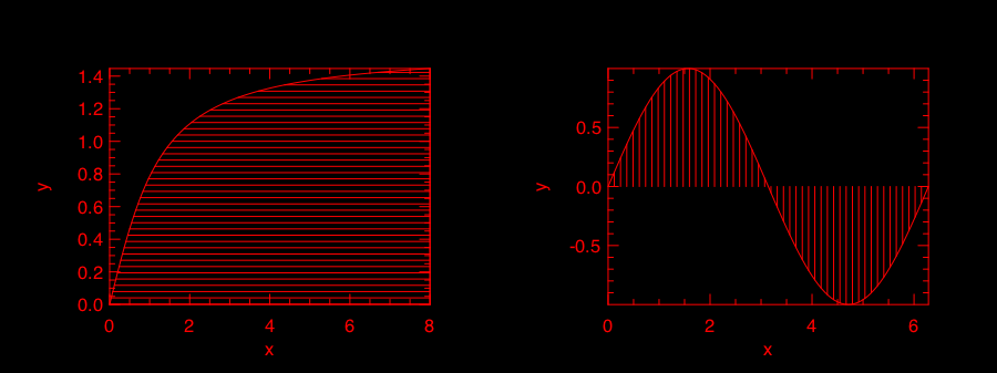
Area Plot
Area plot is similar to line plot but also fills the space between the line and x-axis.
let h = Plot.create ~m:1 ~n:2 "" in
let x = Mat.linspace 0. 8. 100 in
let y = Mat.map Maths.atan x in
Plot.subplot h 0 0;
Plot.(area ~h ~spec:[ FillPattern 1 ] x y);
let x = Mat.linspace 0. (2. *. 3.1416) 100 in
let y = Mat.map Maths.sin x in
Plot.subplot h 0 1;
Plot.(area ~h ~spec:[ FillPattern 2 ] x y);
Plot.output h;;
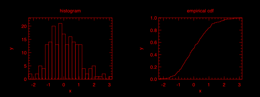
Histogram & CDF Plot
Given a series of measurements, you can easily plot the histogram and empirical cumulative distribution of the data.
let x = Mat.gaussian 200 1 in
let h = Plot.create ~m:1 ~n:2 "" in
Plot.subplot h 0 0;
Plot.set_title h "histogram";
Plot.histogram ~h ~bin:25 x;
Plot.subplot h 0 1;
Plot.set_title h "empirical cdf";
Plot.ecdf ~h x;
Plot.output h;;
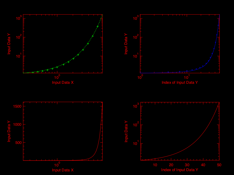
Log Plot
Plot with log-scale on either or both x and y axis.
let x = Mat.logspace (-1.5) 2. 50 in
let y = Mat.map Maths.exp x in
let h = Plot.create ~m:2 ~n:2 "plot_027.png" in

Plot.subplot h 0 0;
Plot.set_xlabel h "Input Data X";
Plot.set_ylabel h "Input Data Y";
Plot.(loglog ~h ~spec:[ RGB (0,255,0); LineStyle 2; Marker "+" ] ~x:x y);

Plot.subplot h 0 1;
Plot.set_xlabel h "Index of Input Data Y";
Plot.set_ylabel h "Input Data Y";
Plot.(loglog ~h ~spec:[ RGB (0,0,255); LineStyle 1; Marker "*" ] y);

Plot.subplot h 1 0;
Plot.set_xlabel h "Input Data X";
Plot.set_ylabel h "Input Data Y";
Plot.semilogx ~h ~x:x y;

Plot.subplot h 1 1;
Plot.set_xlabel h "Index of Input Data Y";
Plot.set_ylabel h "Input Data Y";
Plot.semilogy ~h y;

Plot.output h;;
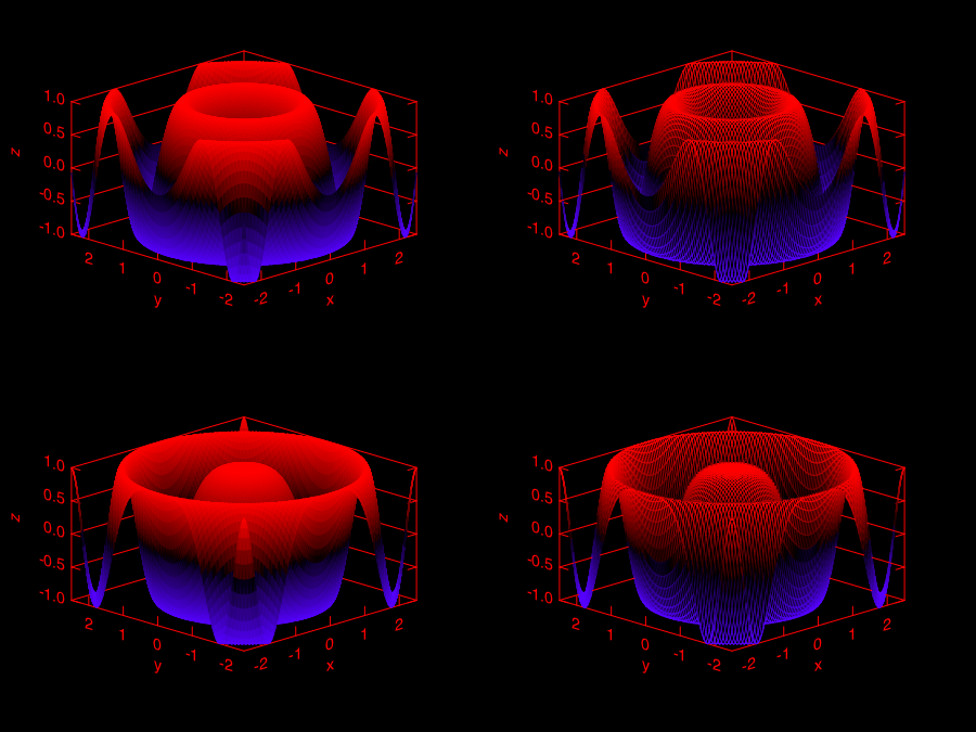
3D Plot
There are four functions in Plot module related to 3D plot. They are surf, mesh, heatmap, and contour functions. Again, I will illustrate them with examples.
First, let’s look at mesh and surf functions.
let x, y = Mat.meshgrid (-2.5) 2.5 (-2.5) 2.5 100 100 in
let z0 = Mat.(sin ((x **$ 2.) + (y **$ 2.))) in
let z1 = Mat.(cos ((x **$ 2.) + (y **$ 2.))) in
let h = Plot.create ~m:2 ~n:2 "plot_016.png" in
Plot.subplot h 0 0;
Plot.surf ~h x y z0;
Plot.subplot h 0 1;
Plot.mesh ~h x y z0;
Plot.subplot h 1 0;
Plot.surf ~h x y z1;
Plot.subplot h 1 1;
Plot.mesh ~h x y z1;
Plot.output h;;
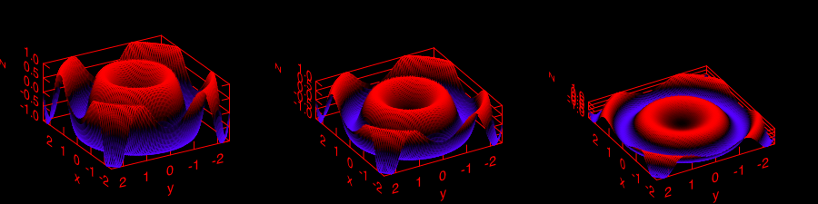
It is easy to control the viewpoint with altitude and azimuth parameters. Here is an example.
let x, y = Mat.meshgrid (-2.5) 2.5 (-2.5) 2.5 100 100 in
let z = Mat.(sin ((x * x) + (y * y))) in
let h = Plot.create ~m:1 ~n:3 "test_mesh.png" in
Plot.subplot h 0 0;
Plot.(mesh ~h ~spec:[ Altitude 50.; Azimuth 120. ] x y z);
Plot.subplot h 0 1;
Plot.(mesh ~h ~spec:[ Altitude 65.; Azimuth 120. ] x y z);
Plot.subplot h 0 2;
Plot.(mesh ~h ~spec:[ Altitude 80.; Azimuth 120. ] x y z);
Plot.output h;;
The generated figure is as below.
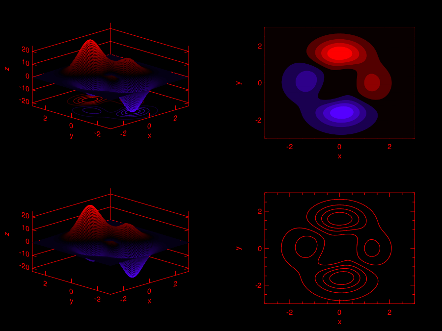
Here is another similar example with different data set.
let x, y = Mat.meshgrid (-3.) 3. (-3.) 3. 50 50 in
let z = Mat.(
  3. $* ((1. $- x) **$ 2.) * exp (neg (x **$ 2.) - ((y +$ 1.) **$ 2.)) -
  (10. $* (x /$ 5. - (x **$ 3.) - (y **$ 5.)) * (exp (neg (x **$ 2.) - (y **$ 2.)))) -
  ((1./.3.) $* exp (neg ((x +$ 1.) **$ 2.) - (y **$ 2.)))
  )
in

let h = Plot.create ~m:2 ~n:3 "plot_017.png" in
Plot.subplot h 0 0;
Plot.surf ~h x y z;
Plot.subplot h 0 1;
Plot.mesh ~h x y z;
Plot.subplot h 0 2;
Plot.(surf ~h ~spec:[ Contour ] x y z);
Plot.subplot h 1 0;
Plot.(mesh ~h ~spec:[ Contour; Azimuth 115.; NoMagColor ] x y z);
Plot.subplot h 1 1;
Plot.(mesh ~h ~spec:[ Azimuth 115.; ZLine X; NoMagColor; RGB (61,129,255) ] x y z);
Plot.subplot h 1 2;
Plot.(mesh ~h ~spec:[ Azimuth 115.; ZLine Y; NoMagColor; RGB (130,255,40) ] x y z);
Plot.output h;;
Finally, let’s look at how heatmap and contour look like.
let x, y = Mat.meshgrid (-3.) 3. (-3.) 3. 100 100 in
let z = Mat.(
  3. $* ((1. $- x) **$ 2.) * exp (neg (x **$ 2.) - ((y +$ 1.) **$ 2.)) -
  (10. $* (x /$ 5. - (x **$ 3.) - (y **$ 5.)) * (exp (neg (x **$ 2.) - (y **$ 2.)))) -
  ((1./.3.) $* exp (neg ((x +$ 1.) **$ 2.) - (y **$ 2.)))
  )
in

let h = Plot.create ~m:2 ~n:2 "plot_018.png" in
Plot.subplot h 0 0;
Plot.(mesh ~h ~spec:[ Contour ] x y z);
Plot.subplot h 0 1;
Plot.heatmap ~h x y z;
Plot.subplot h 1 0;
Plot.mesh ~h x y z;
Plot.subplot h 1 1;
Plot.contour ~h x y z;
Plot.output h;;
Advanced Statistical Plot
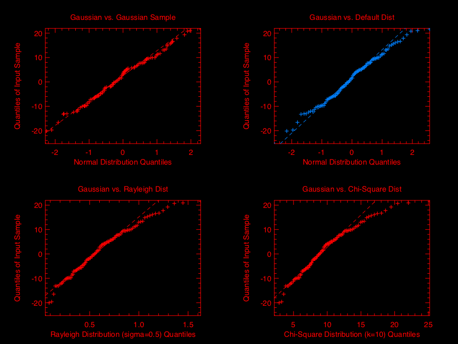
Both qqplot and probplot are simple graphical tests for determining if a data set comes from a certain distribution.
A qqplot displays a quantile-quantile plot of the quantiles of the sample data y versus the theoretical quantiles values from a given distribution, or the quantiles of the sample data x. Here is an example.
let y = Mat.(gaussian 100 1 *$ 10.) in
let x = Mat.gaussian 200 1 in
let h = Plot.create ~m:2 ~n:2 "plot_025.png" in

Plot.subplot h 0 0;
Plot.set_title h "Gaussian vs. Gaussian Sample";
Plot.set_ylabel h "Quantiles of Input Sample";
Plot.set_xlabel h "Normal Distribution Quantiles";
Plot.qqplot ~h y ~x:x;

Plot.subplot h 0 1;
Plot.set_title h "Gaussian vs. Default Dist";
Plot.set_ylabel h "Quantiles of Input Sample";
Plot.set_xlabel h "Normal Distribution Quantiles";
Plot.(qqplot ~h y ~spec:[RGB (0,128,255)]);

Plot.subplot h 1 0;
Plot.set_title h "Gaussian vs. Rayleigh Dist";
Plot.set_ylabel h "Quantiles of Input Sample";
Plot.set_xlabel h "Rayleigh Distribution (sigma=0.5) Quantiles";
Plot.qqplot ~h y ~pd:(fun p -> Stats.Cdf.rayleigh_Pinv p 0.5);

Plot.subplot h 1 1;
Plot.set_title h "Gaussian vs. Chi-Square Dist";
Plot.set_ylabel h "Quantiles of Input Sample";
Plot.set_xlabel h "Chi-Square Distribution (k=10) Quantiles";
Plot.qqplot ~h y ~pd:(fun p ->  Stats.Cdf.chisq_Pinv p 10.);

Plot.output h;;
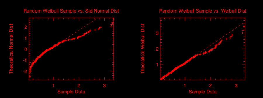
probplot is similar to qqplot. It contains two special cases: normplot for when the given theoretical distribution is Normal distribution, and wblplot for Weibull Distribution. Here is an example of them.
let x = Mat.empty 200 1 |> Mat.map (fun _ -> Stats.Rnd.weibull 1.2 1.5) in
let h = Plot.create ~m:1 ~n:2 "plot_026.png" in

Plot.subplot h 0 0;
Plot.set_title h "Random Weibull Sample vs. Std Normal Dist";
Plot.set_xlabel h "Sample Data";
Plot.set_ylabel h "Theoratical Normal Dist";
Plot.normplot ~h x;

Plot.subplot h 0 1;
Plot.set_title h "Random Weibull Sample vs. Weibull Dist";
Plot.set_xlabel h "Sample Data";
Plot.set_ylabel h "Theoratical Weibull Dist";
Plot.wblplot ~h ~lambda:1.2 ~k:1.5 x;

Plot.output h;;
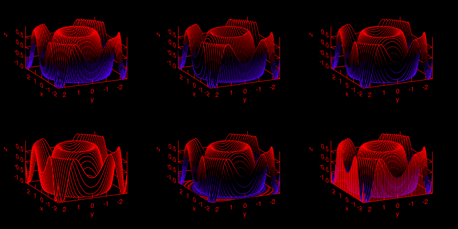
Plot Specification
For most high-level plotting functions in Owl, there is an optional parameter called spec. spec parameter take a list of specifications to let you finer control the appearance of the plot. Every function has a set of slightly different parameters, in case you pass in some parameters that a function cannot understand, they will be simply ignored. If you pass in the same parameter multiple times, only the last one will take effects.
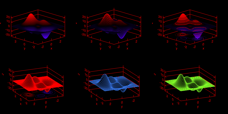
In the following, I will provide some examples to show how to use spec parameter to finer tune Owl’s plots. The first example shows how to configure the mesh plot using ZLine, Contour, and other spec parameters.
let x, y = Mat.meshgrid (-2.5) 2.5 (-2.5) 2.5 50 50 in
let z = Mat.(sin ((x * x) + (y * y))) in
let h = Plot.create ~m:2 ~n:3 "plot_023.png" in

Plot.subplot h 0 0;
Plot.(mesh ~h ~spec:[ ZLine XY ] x y z);

Plot.subplot h 0 1;
Plot.(mesh ~h ~spec:[ ZLine X ] x y z);

Plot.subplot h 0 2;
Plot.(mesh ~h ~spec:[ ZLine Y ] x y z);

Plot.subplot h 1 0;
Plot.(mesh ~h ~spec:[ ZLine Y; NoMagColor ] x y z);

Plot.subplot h 1 1;
Plot.(mesh ~h ~spec:[ ZLine Y; Contour ] x y z);

Plot.subplot h 1 2;
Plot.(mesh ~h ~spec:[ ZLine XY; Curtain ] x y z);

Plot.output h;;
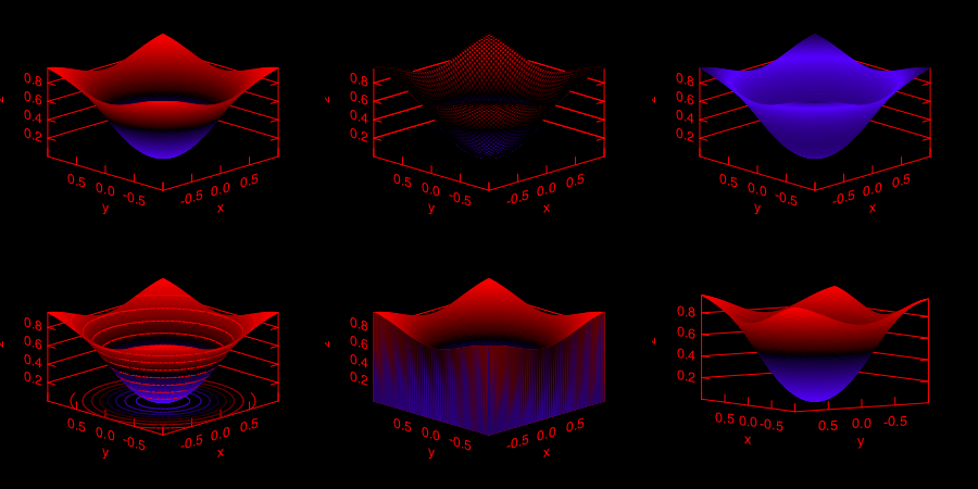
The second example shows how to tune surf plotting function.
let x, y = Mat.meshgrid (-1.) 1. (-1.) 1. 50 50 in
let z = Mat.(tanh ((x * x) + (y * y))) in
let h = Plot.create ~m:2 ~n:3 "plot_024.png" in

Plot.subplot h 0 0;
Plot.(surf ~h ~spec:[ ] x y z);

Plot.subplot h 0 1;
Plot.(surf ~h ~spec:[ Faceted ] x y z);

Plot.subplot h 0 2;
Plot.(surf ~h ~spec:[ NoMagColor ] x y z);

Plot.subplot h 1 0;
Plot.(surf ~h ~spec:[ Contour ] x y z);

Plot.subplot h 1 1;
Plot.(surf ~h ~spec:[ Curtain ] x y z);

Plot.subplot h 1 2;
Plot.(surf ~h ~spec:[ Altitude 10.; Azimuth 125. ] x y z);

Plot.output h;;
If you have made some cool figures using Owl, please do share them with us on Plot Gallery! Thanks.