Alan F. Blackwell
In C. Kann (Ed.), Proceedings of the First ESP Student Workshop , pp. 15-22.
Researchers often ask whether or not a picture is worth a thousand words. Although of interest in many disciplines, this must be of central concern in the design of visual programming languages. Three empirical investigations suggest that the kinds of pictures used as visual programming languages do convey a predictable amount of information. This seems to be because people prefer diagrams drawn at a certain level of granularity, regardless of syntactic or semantic manipulations. A fourth study provides an alternative explanation - these results could arise from experimental demand factors. The conclusion is therefore more cautious than the title.
"A picture is worth a thousand words." This popular faux-Chinese proverb could be the first sentence in a credo of visual programming research. But is it accurate? As noted in Blackwell (1996), many research publications make disguised references to the proverb. For example "pictorial forms offer a high bandwidth mechanism of communication - pictures and images may be easier to assimilate than text" (Barker & Manji, 1989).
Is a picture worth a thousand words in visual programming? All proverbs exaggerate to make a point. Nevertheless, the actual information content of pictorial representations is centrally relevant to several open questions in visual programming research:
These are not new concerns that have arrived with visual languages. Investigations of textual languages have considered the same issues. Complexity metrics such as Halstead's (1977) were an attempt to measure granularity - how much information can be included in a line of code, or sequence of tokens? Issues of scalability are critical in all programming languages - is there some size of project for which interactions between program elements become impractically complex? Considerations of screen real estate produce one of the first pieces of advice given to new programmers - the ideal size of a module is about the amount of text that will fit in a single screen (e.g. Pressman 1982).
When expressed by analogy to textual languages, we see that although these open questions deal with information content, content alone is not the most significant issue in visual language design. The main issue is how people interact with information, as analysed in Green's cognitive dimensions of notations (Green & Petre 1996). The three quantitative concerns of granularity, scalability and screen real estate are closely related to the cognitive dimensions of diffuseness, viscosity and visibility. As with the other cognitive dimensions, these three provide a framework for analysing the usability of a notation, regardless of whether it is pictorial or textual.
What, then, does it mean to ask whether a picture is worth a thousand words? The comparison of pictorial and textual notations can teach us something about both, and it is possible to make that comparison empirically. This paper describes three empirical studies that cast some light on the question. The claim made in the title may not be completely serious. Nevertheless, it is not the first time that an academic paper has made some judgement about the accuracy of the proverb.
Mieder (1990) has traced the origin of the saying "a picture is worth a thousand words" to Fred Barnard, an advertising manager in the early 1920s. Barnard used these words as a headline when selling advertising in trams. He originally claimed that it was a Japanese proverb, then in a later advertisement that it was Chinese - a literal Chinese translation in his copy lent authenticity. Some dictionaries of quotations now accept Barnard's claim of Chinese origin at face value, and this idea of ancient Chinese wisdom has inspired researchers who publish papers claiming that pictures are or are not worth a thousand words. In the light of the actual origin of the saying, we can make an interesting observation. Barnard's claim was not about information content, but affect - when used in advertising, a picture draws attention more than text.
This agrees with Ittelson's (1996) analysis of the visual perception of markings. Ittelson challenges the pictorial assumption that perceiving pictures is the same as perceiving the world. Perception of the world is about existence - what is immediately present. Markings are important not because they report the state of the world, but because of their affect - the way that they influence the thoughts of the perceiver. This distinction gives reason to question the principle of direct manipulation, for example.
As a research question, the comparative utility of words and pictures has inspired much interest. The literature includes publications that support the proverb (they could be termed milleverbalists) and others that note the limitations of pictorial representations. Some examples are: "Is a picture worth a thousand words?" (Bishop 1977), "A picture is not always worth a thousand words" (Willows 1978), "When a picture is not worth a thousand words" (DeLoache & Marzolf 1992), "A picture is worth a thousand words, but that's the problem" (Gleitman & H. Gleitman 1992), "Why a diagram is (sometimes) worth ten thousand words" (Larkin & Simon 1987), and "When is an illustration worth ten thousand words?" (Mayer & Gallini 1990).
Apart from differences over the number of words (one thousand or ten), these publications supply an interesting range of perspectives. The most familiar in the computer science community is Larkin and Simon (1987), which analyses the advantages that diagrams provide over propositional representations. Diagrams are computationally efficient, because search for information can be indexed by location; they group related information in the same area. They also allow relations to be expressed between elements without labelling the elements. This paper is now cited by many researchers as a starting point for analysis of reasoning with diagrammatic representations.
The article by Bishop (1977) describes his experience of working with children in a non-Western culture. He found that the educational benefits of pictures were greatly reduced by the difficulty that his students had in interpreting apparently common pictorial conventions, including use of perspective, ordering comic strip panels from left to right, and motion implicit in instantaneous position. All of these have been exploited in visual languages, and might otherwise be thought cross-cultural. Petre (1995), also emphasises the importance of experience in interpreting pictorial notations (and joins the antimilleverbalist camp by saying that a picture is not necessarily worth a thousand words).
Mayer and Gallini (1990), and Willows (1978) report the benefits of pictures illustrating text. Mayer and Gallini find that the combination of pictures and text is more memorable than either alone, and that pictures encourage formation of conceptual memories. Illustrations also improved performance when solving a problem derived from the text, but those with prior experience of the domain did not benefit. Willows (1978) notes that when children are reading, illustrations can distract from the text and slow down reading. This is interpreted as a disadvantage, although there was no test of improvements in comprehension.
The relationship between vision and verbal communication is of great interest to developmental researchers, as well as those who argue for visual programming on the grounds that we are more familiar with visual representations owing to early visual stimuli. DeLoache and Marzolf (1992) describe a series of experiments in which the nature of reference is studied through pictures that refer to the real world. They draw distinctions between the development of representational insight (that something stands for other than itself) and representational specificity (understanding that a symbol can stand for a specific object, rather than a generic category). These capabilities are not innate, but develop through experience with representations.
Gleitman and Gleitman (1992) analyse how we learn verbs; there is so much information in a baby's environment that it is impossible to know what is the referent of a new word. Vocabulary must therefore be derived from syntax. The same case is made specifically for visual languages by Wang, Lee & Zeevat (1995) - "It is often said that a picture is worth a thousand words, but it seems hard to say which picture is worth which thousand words". A process of abstraction must be involved - not all information in the diagram is relevant. It is this process that makes diagrams useful. Dondis (1973) draws the same conclusion - abstraction is the most valuable attribute of a picture. A symbol is even more abstract, so if one picture is worth a thousand words then one symbol is worth a thousand pictures.
These investigations of the benefits of pictures provide useful perspectives on the function of pictorial representations and diagrams. The remainder of this paper reports on empirical studies that were carried out to investigate further the relevance of the above research to visual programming. The first of these studies is an investigation of the effect of expertise in determining the value of different language designs. The second and third experiments progressively remove the imposition of syntax rules on the creation of diagrams in order to investigate whether the basic elements of vocabulary in a visual language have an effect independent of syntax. They also investigate the effects of "real estate" on creation of diagrams by looking at diagram creation on three different scales - a paper prototype on a tabletop, arrangement of icons on a high resolution screen and freehand pencil drawings on a large piece of paper. Participants in these experiments were selected from the volunteer panel at the Applied Psychology Unit.
The first of these investigations studied experimental subjects who were asked to create a program using a paper prototype of a visual programming language. They included four experienced programmers and eight subjects who had never written a program before.
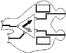
Materials: The basic elements of the programming language were cutout shapes about 10 cm across. They represented elements in a basic dataflow language, such as choice, addition and comparison. An illustration of a "choice" component is shown in Figure 1. Components were connected to form a program. The workspace was a tabletop measuring 70 by 280 cm.
Figure 1 - A dataflow ("Choice") component
Procedure: The experiment involved four small programs. First the experimenter demonstrated the creation of a program. The components were shuffled, and the subject asked to recreate it. Then the subject was shown a complete program, and was asked to explain how it would work, and to find a bug in it. After these introductory tasks, the subject created two more original programs from a simple specification.
Results: Performance for each subject was measured in terms of time required to complete all four tasks, and elaboration of the solution - the number of components used. Programmers were superior both in time required to complete the task (35 minutes on average, versus 57 for non-programmers (F=6.07, p<0.05)) and number of components (11.6 versus 9.0 (F=19.66, p<0.05)). This was true despite the fact that the programmers had not used a dataflow language before, had not used a visual programming language before, and had certainly not seen this particular language before. This finding confirms those of Petre and Green (1993) with regard to the value of expertise in using notations, but also extends those findings - expertise in a whole class of notations (programming languages) can have more effect on performance than any specific notational variation.
The solutions produced were remarkably similar in the number of components used. Although there was a large variation between programmers and non-programmers in solution time, the elaborateness of the solution did not vary to the same degree. This may have been an effect of the real-estate available for constructing the program (although the table was never completely filled) or it may have been an effect of perceived granularity or scalability of the components. It may simply have been due to the fact that the subjects were influenced by the two example programs they were shown, and tried to produce programs of similar complexity themselves. The next experiment was designed to investigate these issues.
In the first experiment, the main effect on performance could be attributed to programming expertise. The second experiment aimed to investigate effects of notation in a task comparatively free of expertise issues (all participants were non-programmers), as well as testing whether the same effects could be observed when using an on-screen editor.
Materials: The 24 participants in this experiment used a simple node and link editor, with a palette of four node shapes. Nodes could be connected to each other at defined input and output points, and the connection lines would 'rubber-band' to follow the nodes when they were moved. A detail of a diagram being created using the diagram editor can be seen in Figure 2.
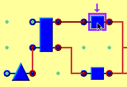
Figure 2 - Detail of diagram editor
Procedure: Subjects were shown an animated demonstration (created in MacroMedia Director) of the editor, but were never shown a complete diagram, and no mention was made of how complex a diagram ought to be. They were then asked to draw diagrams showing how common household devices worked. The devices included a washing machine, motorbike, television, telephone, coffee machine and calculator. These were chosen so that subjects would have varying levels of familiarity with them, while being sufficiently familiar to allow very different levels of elaboration.
Results: The complexity of the devices appeared to have little effect on elaboration of the diagrams. The calculator tended to have more nodes because one was often created for each function key. If the calculator is not included in the analysis however, there is no clear effect of device on the number of nodes in the diagram (p=0.22). The average number of nodes overall was 8.3, and only the calculator had an average outside the range 7.3 to 9.3. The diagrams were not large with respect to the screen - there was room for twice as many nodes. Neither were subjects limited by time - most stopped drawing before the allotted time. This consistency in simple diagrams drew attention to the main theme of this paper - is there some consistent level of elaboration when using a node and link notation, and is it independent of both notational details and the task? The third experiment was designed to test this hypothesis further.
The earlier experiments investigated diagrams both with and without formal semantics, and in different manipulation environments. The next experiment provided a more familiar production environment: pencil and paper.
Procedure: Six subjects were asked to explain the workings of the same six household devices as in the previous experiment. Each subject was asked to draw a diagram explaining three of the devices, and to write a passage of text explaining the other three. The allocation of writing or drawing was varied between subjects, so each device had three written and three diagrammatic descriptions. The instructions for drawing diagrams were simplified even further in this experiment - subjects were asked to choose any simple shapes they liked and join them together with lines. An example production is shown in Figure 3. Once again, no complete example of a diagram was shown to subjects.
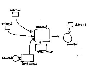
Figure 3 - Freehand diagram of a motorbike
Results: This experiment confirmed the elaboration consistency seen in the previous two. Despite being given a large sheet of paper, and ample time to draw complex diagrams, subjects still drew small diagrams with a similar number of nodes to earlier experiments. In order to compare the diagrams to prose descriptions of the same devices, the descriptions were analysed to identify semantic referents and links between them. These measures were compared to the content of the diagrams. There were an average of 10.8 referents in the prose and 6.9 nodes in the diagrams (F=8.79, p<0.05). Some of this difference can be accounted for by references to the user of the device in prose narratives, whereas the user never appeared as a node in a diagram. Nevertheless, it seems that participants elaborated further when describing devices in text form than in diagrams.
Discussion: These experiments displayed a uniform degree of elaboration in node and link diagrams. No subject created a diagram with 30 nodes, and none used only two, despite the fact that either of these levels of complexity would have been quite feasible using the available tools, and sometimes justified by their knowledge of the domain. The different editing environments did result in small variations in elaboration. The average number of nodes was 9.0 for non-programmers using paper cutouts, 8.3 using the screen editor, and 6.9 with paper and pencil.
Despite very different editing facilities, these levels of elaboration are very similar. Why is this? It seems unlikely that it was caused by the tools - the differences between paper cutouts, on-screen icons, and pencil drawings are so great that there are few common elements beside the node and link formalism. It is also unlikely that there is any effect of "screen real estate". The first two experiments provided working areas on very different scales, while the third allowed subjects to define the scale. Is there an effect of granularity or scalability that might cause the uniformity? In the second and third experiments, subjects were free to choose their own level of granularity for components, but it was no different from the level of prose elements in the third experiment. Perhaps the consistency of elaboration results from short term memory limitations - subjects may find it hard to plan more complex diagrams. It could be explained in terms of Miller's famous observation (Miller 1956) - the number of nodes does fall within the range of seven plus or minus two.
These findings could carry interesting implications for the design of visual programming languages. If the ideal size for a code module is about one page of text, perhaps these experiments form the basis for analogous advice to visual programmers. It is clear that non-programmers are comfortable at around this level of complexity. This is an interesting idea, but there is an alternative explanation for the consistent results in the above experiments; they might be caused by experimental demand factors. Participants might only put as much effort into the task as they think the experimenter expects. The second and third experiments did avoid any cues regarding expected solutions, but the responses might be derived from participants' experience of published diagrams. This concern led to the fourth experiment.
In the fourth experiment, eight participants were asked to produce freehand diagrams using a pencil and paper, as in the third experiment. The devices that they were asked to explain varied greatly in complexity. Two were extremely simple: a pencil sharpener and an electric light. Two corresponded to the least complex devices in experiments two and three: a transistor radio and a construction crane. Two were more complex: a central heating system and a bank account. Finally, two tasks were as complex as possible: a baked bean factory, and the British Parliamentary system.
Procedure: This experiment also included an explicit manipulation of the amount of effort expected. Diagrams were produced in two conditions. In the 'fast' condition, subjects worked with a stopwatch running in front of them. In the 'detail' condition, the stopwatch was turned off, and subjects were told "Add as much to each diagram as you can imagine or invent, making them as detailed as possible." One task from each pair was assigned to each condition.
Results: Analysis was again based on the number of nodes in each diagram. Comparisons were made between four levels of complexity, and between the fast and detail conditions. Hypothesis A was that more complex tasks would result in more elaborate diagrams. A planned contrast analysis supported the hypothesis of a linear trend ( t=3.51, p<0.01). The degree of elaboration resulting from this extreme manipulation ranged from 5.6 nodes (least complex) to 13.3 (most complex). Hypothesis B was that diagrams produced in the detail condition would have more nodes. A comparison of means supported this hypothesis ( t=3.61, p<0.01). This manipulation of demand has about the same effect size as that of complexity, varying from 5.9 nodes (fast) to 12.3 (detail). The potential criticism of the first three experiments, that the uniform complexity resulted from experimental demand factors, is obviously justified insofar as demand factors are very influential in this experimental paradigm.
An earlier (unpublished) version of this paper hypothesised that a fairly uniform level of diagram elaboration would be observed across a very broad range of task complexity. It made that prediction on the basis of the uniformity observed in the first three experiments. Since then, the fourth experiment has demonstrated that diagram elaboration can increase in response to increased task complexity. It also demonstrated that experimental demand effects can be very large by comparison to the effects of other treatment factors in this experiment.
The motivation for this investigation was to find out whether visual programming languages are subject to a general bias toward simplification in diagram production. If so, the various claims that a picture is worth a thousand words might not be applicable to programming. The information content of a visual program (or any diagram) might be more dependent on the author than on properties of the notation. It still seems plausible that this is the case, but future experiments must be more cautious in controlling for experimental demand factors.
Finally, I seem to have neglected a question of great interest: How many words is a picture worth? My experimental data cast new light on both Fred Barnard's advertising slogan and on studies such as Nicholson Baker's (1983) investigation of the size of thoughts. In my third experiment, participants described in words the same information expressed in a single diagram by others. From the average number of words used, I calculate that - a picture is worth 84.1 words.
This research is funded by a collaborative studentship from the Medical Research Council and Hitachi Europe Ltd. The author is grateful to the Advanced Software Centre of Hitachi Europe for their support.
Baker, N. (1983). The size of thoughts. The Atlantic Monthly, 251(3), 32-38.
Barker, P.G. & Manji, K.A. (1989). Pictorial dialogue methods. International Journal of Man-Machine Studies, 31(3), 323-347.
Bishop, A. (1977). Is a picture worth a thousand words? Mathematics Teaching, 81, 32-35.
Blackwell, A.F. (1996). Metacognitive theories of visual programming: What do we think we are doing? In Proceedings IEEE Workshop on Visual Languages, VL'96.
DeLoache, J.S. & Marzolf, D.P. (1992). When a picture is not worth a thousand words: Young children's understanding of pictures and models. Cognitive Development, 7, 317-329.
Dondis, D.A. (1973). A primer of visual literacy. Cambridge, MA: MIT Press.
Gleitman, L.R. & Gleitman, H. (1992). A picture is worth a thousand words, but that's the problem: The role of syntax in vocabulary acquisition. Current Directions in Psychological Science, 1(1), 31-35.
Green, T.R.G. & Petre, M. (1996). Usability analysis of visual programming environments: a 'cognitive dimensions' approach. Journal of Visual Languages and Computing, 7(2), 131-174.
Halstead, M.E. (1977). Elements of Software Science. New York: Elsevier.
Ittelson, W.H. (1996). Visual perception of markings. Psychonomic Bulletin & Review, 3(2), 171-187.
Larkin, J.H. & Simon, H.A. (1987). Why a diagram is (sometimes) worth ten thousand words. Cognitive Science, 11, 65-99.
Mayer, R.E. & Gallini, J.K. (1990). When is an illustration worth ten thousand words? Journal of Educational Psychology, 82(4), 715-726.
Mieder, W. (1990). 'A picture is worth a thousand words': From advertising slogan to American proverb. Southern Folklore, 47, 207-225.
Miller, G.A. (1956). The magical number seven, plus or minus two: some limits on our capacity for processing information. Psychological Review, 63, 81-97.
Petre, M. (1995). Why looking isn't always seeing: readership skills and graphical programming. Communications of the ACM, 38(6).
Petre, M. & Green, T.R.G. (1993). Learning to read graphics: some evidence that 'seeing' an information display is an acquired skill. Journal of Visual Languages and Computing, 4(1), 5-33.
Pressman, R.S. (1982). Software Engineering: A Practitioner's Approach. McGraw-Hill.
Vecchi, T., Monticellai, M.L. & Cornoldi, C. . (1995). Visuo-spatial working memory: structures and variables affecting a capacity measure. Neuropsychologia, 33(11), 1549-1564.
Wang, D., Lee, J. & Zeevat, H. (1995). Reasoning with diagrammatic representations. In J. Glasgow, N.H. Narayanan & B. Chandrasekaran (Eds). Diagrammatic Reasoning: Cognitive and Computational Perspectives. Menlo Park, CA: AAAI Press, pp. 339-393.
Willows, D.M. (1978). A picture is not always worth a thousand words: Pictures as distractors in reading. Journal of Educational Psychology, 70(2), 255-262.
 Blackwell's home
page.
Blackwell's home
page.