In his book, The Visual Display of Quantitative Information, Edward Tufte argues for the maximisation (within reason) of non-redundant data-ink which shows variation in the numbers represented, and the minimisation of other ink. This implies that non-data-ink and redundant data-ink should be deleted where reasonable, and the remaining ink used to represent as much new information as possible.
From these principles, Tufte suggests redesigning several types of graphs and this page describes my implementation of some of the ideas presented, using GNU R. I have mainly concentrated on the scatterplot, although the redesign of axes is applicable to many types of charts, for example I have used it on histograms and time-series plots. If you would like to try it out for yourself, the source is available under the GPL license.
To draw these graphs I have written 4 functions, to be used with the the normal R plotting commands. These are as follows:
fancyaxis()clippedjitter()minimalrug()axisstripchart()The diagrams below show examples of these functions, using the
faithful
dataset provided with R. This lists 272 eruption durations and the
time till next eruption, of the Old Faithful geyser in Yellowstone
National Park, Wyoming, USA. The example code
used to generate them is also available.
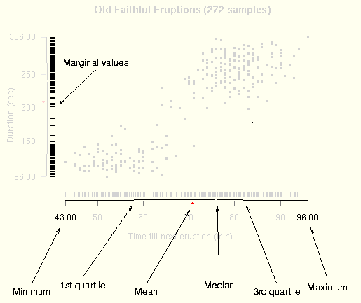
This graph shows the correlation between the duration of an
eruption and the time till the next eruption. The modified axes, drawn
by fancyaxis() show information about the
marginal distribution of both variables:
The marginal value of each sample is plotted as a rug chart on the
respective axis. In this dataset, due to low recorded precision, there
are many ties so an unmodified rug chart will not fulfil the purpose of
showing density. R provides the jitter() function, which
adds random noise to a vector and this could be used to solve the
problem. However, using jitter() could shift points
outside the original range, which would be noticeable due to the
indicated minimum and maximum. For this reason, I have, used
clippedjitter(), which performs like
jitter(), but it will not modify the minimum or
maximum.
The R rug() function is based on axis()
so draws a baseline in addition to the ticks. This is redundant so I
use minimalrug() which will draw only the
ticks. This function could also be used by itself to produce the
dot-dash plot also suggested by Tufte.
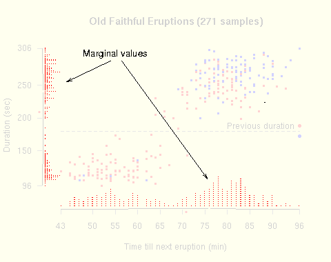
As described above, clippedjitter() can be used to
display density information of a variable with many ties. However, this
is not always ideal, since it hides information about the rounding
applied to the data. As an alternative,
axisstripchart() draws a bar plot on the axis,
showing the frequency distribution of the respective variable.
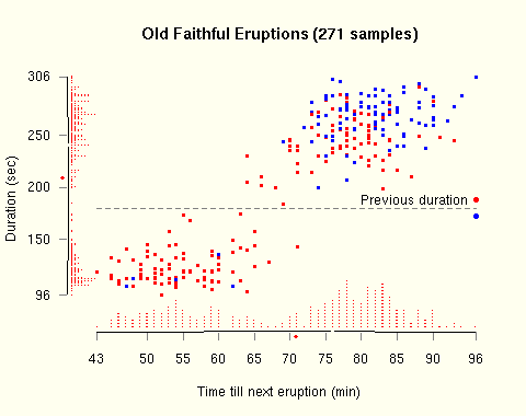
This graph shows the how the fancyaxis() and
axisstripchart() functions can be used. In
addition, the points have been coloured to increase the dimensionality
of the graph. Red indicates that the previous eruption was
longer than 180 seconds, blue indicates that it was shorter than 180
seconds.
It appears that when one eruption is of the short type (shorter than 180 seconds), the next one will probably be of the long type (longer than 180 seconds). This is apparent from the graph, and is backed up by the numbers. 36% of eruptions are short. Where the previous eruption is short, only 6% of eruptions are short, but where the previous eruption is long, 52% of eruptions are short.
I have used this style of graph in the paper "Message Splitting
Against the Partial Adversary" by Andrei Serjantov and Steven
J. Murdoch. The pages showing
diagrams are available by themselves, as well as the full paper. Rather than a
scatterplot, this consists of time-series plots and histograms of
frequency distributions. Still, fancyaxis() and
minimalrug() can be used. For the time-series
graphs in figure 9, only the Y axis uses the modified axis, as the
frequency distribution of sample times is not particularly
informative. Similarly, only the X axis has been modified for
histograms, as using it on the Y axis would show the frequency
distribution of a frequency distribution, which is quite subtle and of
dubious value. The rug plot is used on the histograms to show the
actual data values and reveal any artifacts which were hidden by
allocating values to bins. Finally, in addition to showing the values
of the summary, table 1 acts as a key to the modified axes.
The functions for drawing the broken axes, jittered rug plot and strip chart can be found in fancyaxis.R. The code used to generate the examples on this webpage can be found in examples.R. The source code is distributed under the GPL, the same license used for the majority of R.
This is very much a work in progress and still of alpha quality. It
currently does not fully deal with logarithmic scales and needs manual
tweaking of several values to suit different data and output device
resolution. Drawing tickmarks and labels is performed by
axis(), which always draws a baseline. This is then
erased with the background colour so it does not work properly with a
transparent background. Also, in some rendering engines of PDF and
Postscript output the erasure is not complete and some parts of the
baseline are still visible. A reimplementation of axis()
in R code was intolerably slow so the full solution would be to modify
the C implementing axis(), adding an option to disable
the drawing of the baseline. I plan to do this, but it is not yet
complete. The code should ideally be placed in a package, rather than
a file which is sourced. I plan to do this once the code is more
stable and there is proper documentation written.
There is more discussion on other graphing software and visualisation techniques, including this package, in a post on the Ask E.T. forum.
Comments and suggestions are appreciated. Please see my contact details.