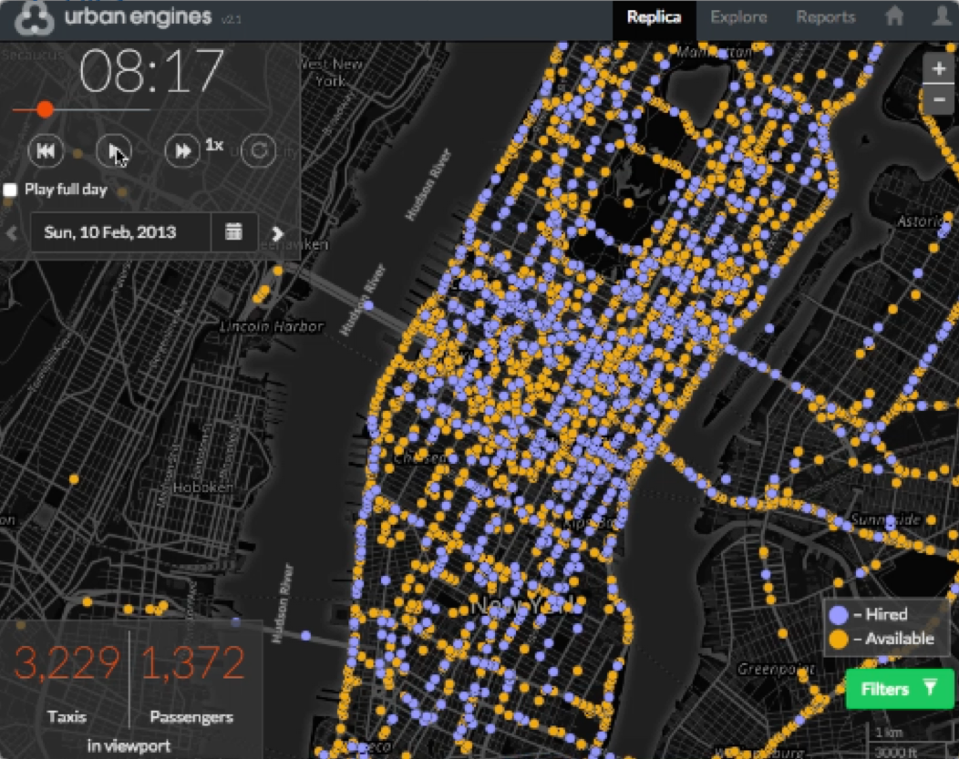
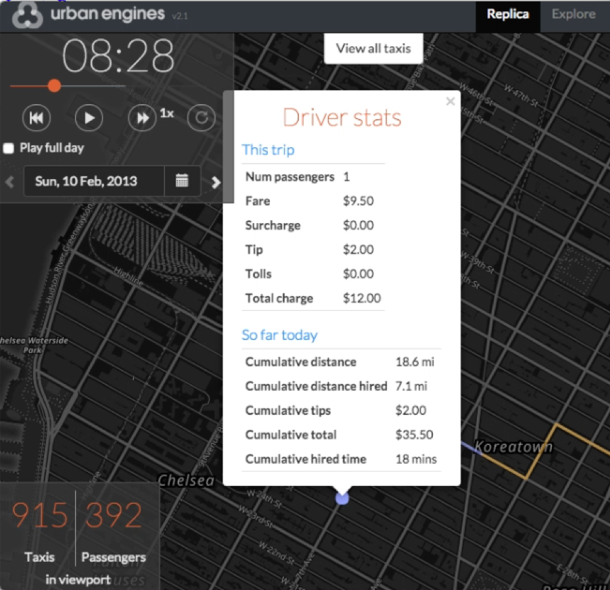
Taxis of NYC
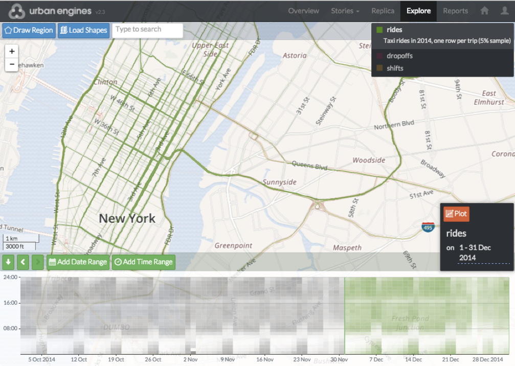
I spent 2011–2016 as the chief data scientist at Urban Engines, a Silicon Valley startup now part of Google. We built a big data analytics and visualisation platform. Here are some screenshots, after we fed it with data obtained from the New York City taxi and limousine commission [source data].
The Urban Engines dashboard lets you drill down and see any individual entity, or zoom out and see overall patterns. It also lets you create custom plots based on formulae, like these two:
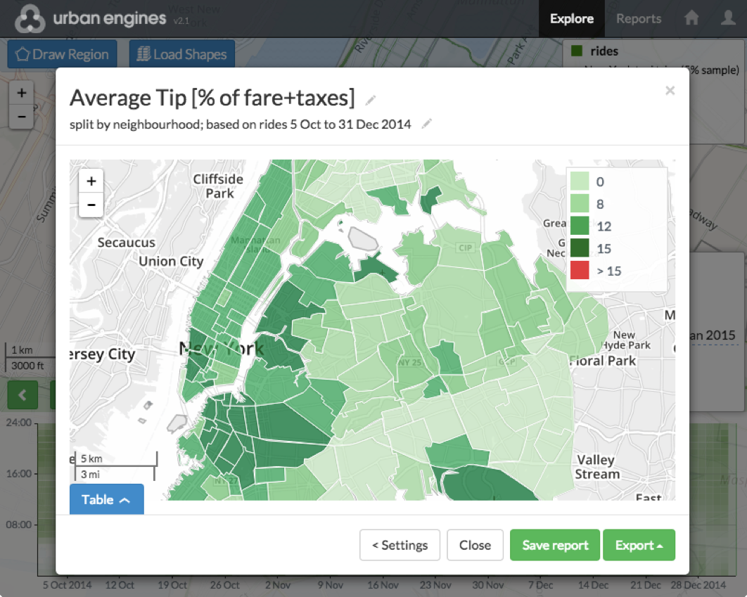
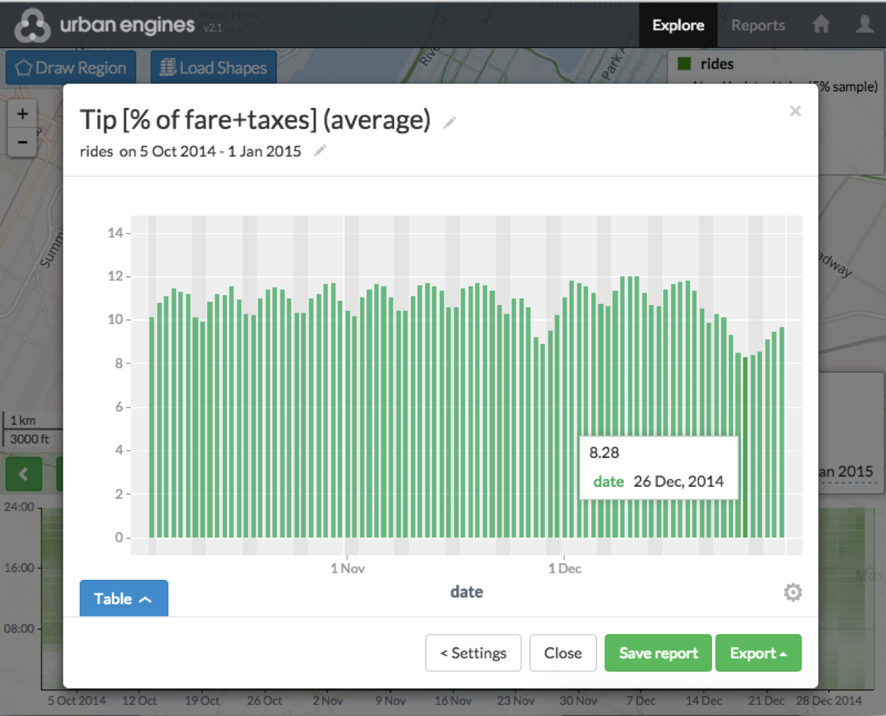
The first plot shows tip percentage based on where the taxi trip starts. The second plot shows tip percentage on each date: there's a big drop at Thanksgiving, and an even bigger drop at Christmas. Is this just New York holiday spirit?
In fact, if you look at tip percentage broken down by payment type, you see (1) tips are higher at Thanksgiving and Christmas, (2) more trips are paid for in cash rather than with credit card at these times, (3) tip amount is recorded as 0 for cash payments. Can we build a data analytics tool that alerts you to confounding facts like this?