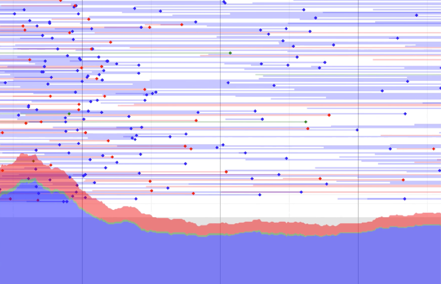
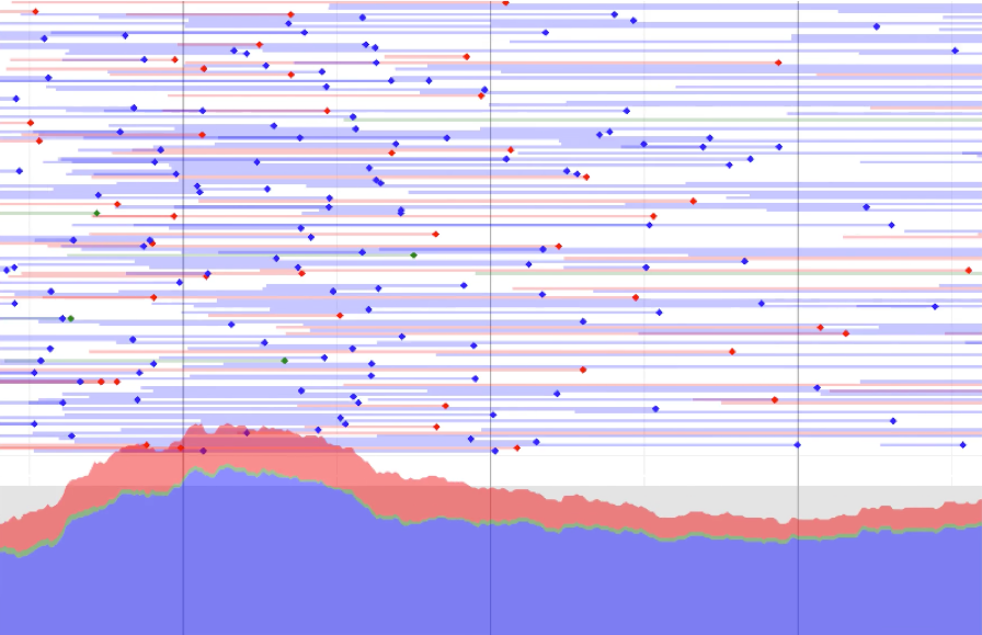
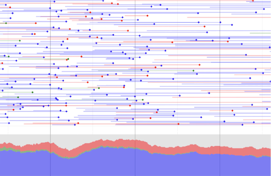
Three snapshots of a road, showing the instant that congestion hits.
The three panels are 30 seconds apart. In the first panel the average speed is 60 miles per hour; in the third it is 15 miles per hour. The horizontal axis is distance along the road, spanning 1.1 miles, and traffic flows from left to right. The area plot shows vehicles per minute at each spot. The dots show each individual vehicle, with a tail covering one minute's travel.Road congestion
These panels show three snapshots of a motorway at the instant that congestion hits. Average speed drops from 60mph in the first panel to 15mph in the third.
The data comes an overhead gantry, positioned in the middle of the road segment shown in the plots; it records the timestamp and ID and speed of every vehicle passing underneath, for billing purposes. It turns out that the average speed between gantries is still around 15mph, even when the speed at a gantry is down to 15mph, which means that congestion is most likely caused by the 5% of vehicles that have to change lanes to go into the cash toll lane.
For each vehicle I drew a tail covering one minute's worth of travel. This means that at every spot along the road, you just add up the number of tails, and you get total throughput at that spot. These fine-grained throughput plots are fairly level when there is no congestion, and they look like waves crashing on the shore when there is congestion.