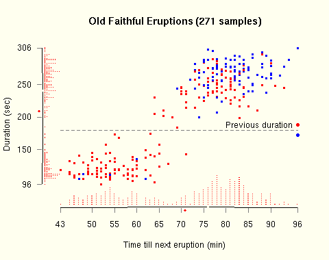
Example graph showing correlation between time between eruptions
and duration of eruption. Also, the duration of the previous eruption
is indicated by the colour of points. Red indicates that the previous
eruption was longer than 180 seconds, blue indicates that it was
shorter than 180 seconds.
(PDF version)

Rugplot with jittered marginal data, but where the jitter does not
alter the minimum or maximum.
(PDF version)

Small multiples, showing observations divided into 5 batches,
ordered by time.
(PDF version)

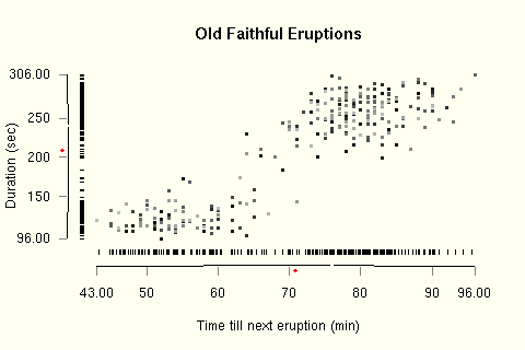
Here the point colours correspond to the duration of the previous
eruption. The lighter the point, the longer it was.
(PDF version)

This autocorrelation is clear when displayed using the R default
lag plot
(PDF version)
For comparison, here is the original version. The shading of points
indicates the observation index, dark first.
(PDF version)
The functions for drawing the broken axes, jittered rug plot and strip chart can be found in fancyaxis.R. The code used to generate the examples on this webpage can be found in examples.R. The source code is distributed under the GPL, the same license used for the majority of R.